
Kimberly-Clark · Sustainability film · 1:01
A Decisive Decade
Kimberly-Clark's 2030 sustainability strategy: improve the lives and wellbeing of one billion people in underserved communities, with a smaller footprint.
Kimberly-Clark · Logo design
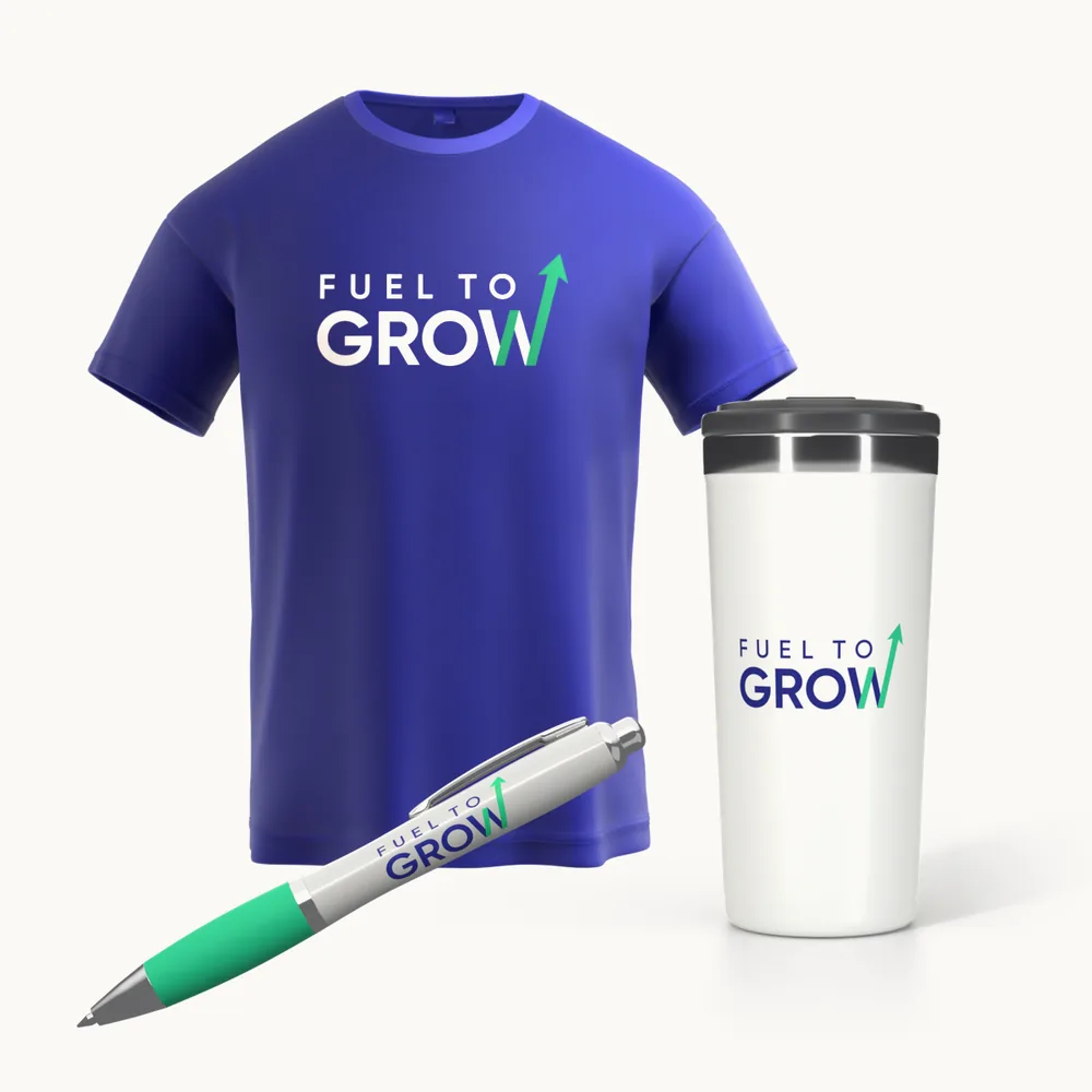
The logo for Fuel to Grow, the global supply chain transformation Kimberly-Clark kicked off in March 2021: nine directions, one mark, animated.
The big question
Kimberly-Clark
Logo design
2021
0:06
The brief
Our approach
What we made
The logo
The payoff
One mark for the March 1, 2021 kickoff, animated, and built to work small on a slide and big on a screen.
Kimberly-Clark · Sustainability film · 1:01
Kimberly-Clark's 2030 sustainability strategy: improve the lives and wellbeing of one billion people in underserved communities, with a smaller footprint.
McCormick · Sizzle reel · 1:30
A sizzle reel on McCormick's leadership in flavor innovation and its recent developments.
Under Armour · Social campaign
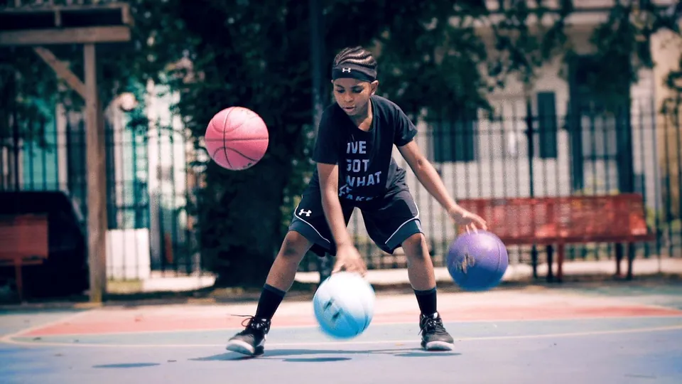
An Instagram-first campaign celebrating young girls in sport: five sports, every social format and one hero reel.
A few lines is plenty. You will hear back from a person.
Based in Washington, DC, Maryland and Virginia. Crew nationwide.